

How to adjust the accessibility color options on iPhone and iPad

For those with visual impairments or others who wish to reduce eye strain, your iPhone and iPad offer accessibility color features that can be adjusted to suit you.
If you haven’t taken the time to explore these options yet or just obtained a new device, we’re here to help. Here’s how to adjust the accessibility color options on iPhone and iPad.
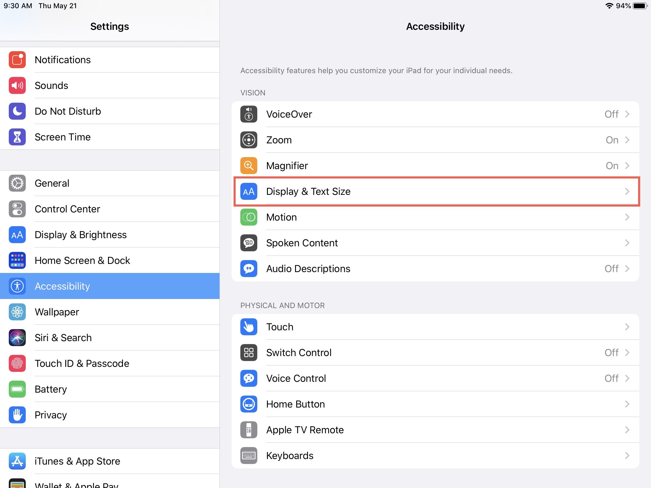
Accessibility color features on iPhone and iPad
Access the settings
For each of the iOS accessibility features below, you’ll head to the same spot on your iPhone or iPad.
Open Settings, select Accessibility, and tap Display & Text Size.
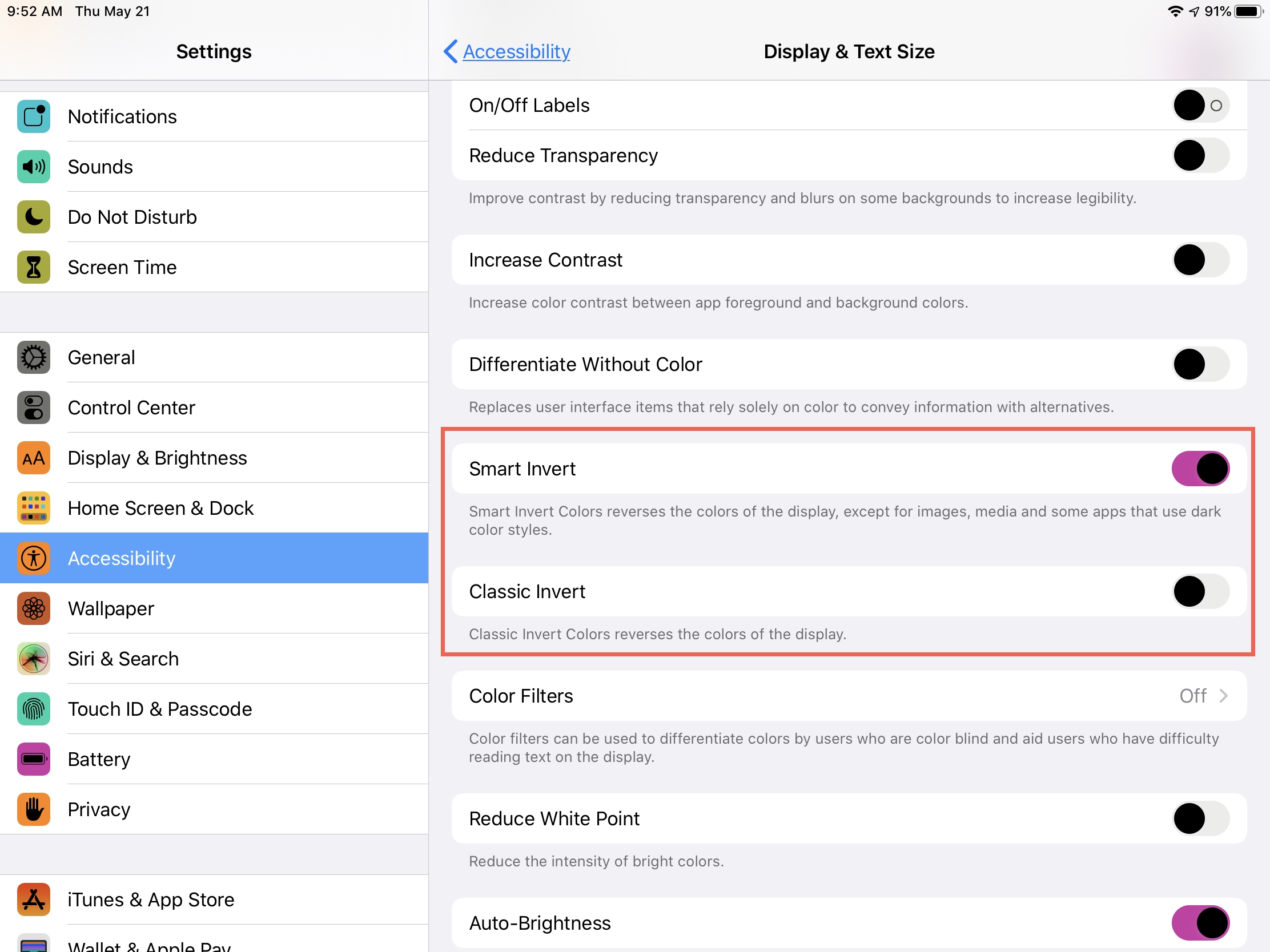
Invert colors
Apple provides two ways to invert colors on your device; Smart Invert and Classic Invert.
- Smart Invert will reverse all colors except for images, media, and apps that use dark colors.
- Classic Invert will reverse all colors.
You can choose to enable one of these toggles on the Display & Text Size screen.
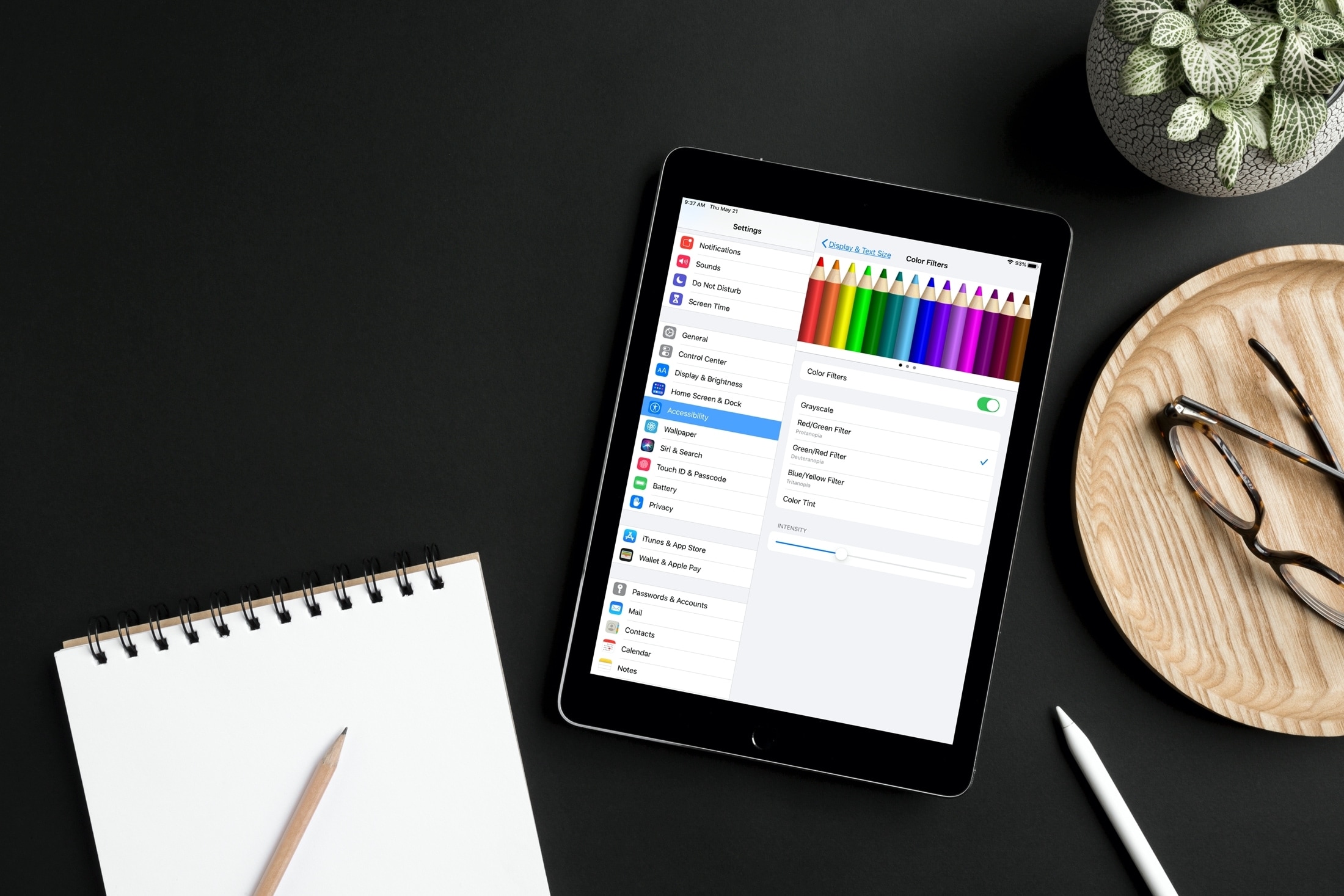
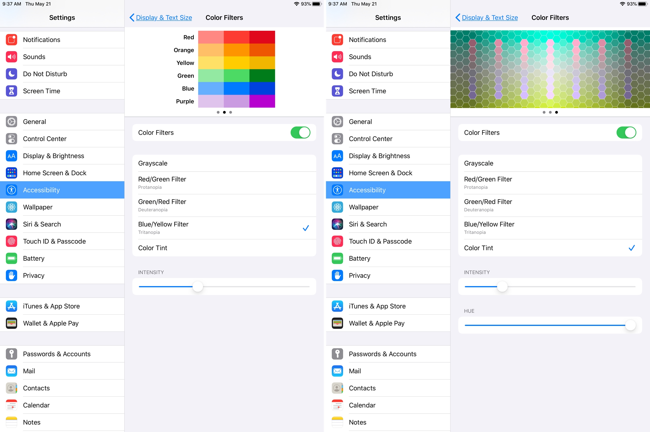
Use color filters
If you’re color blind, applying color filters can make differentiating colors easier when reading text.
1) Tap Color Filters and enable the toggle for it on the next screen.
2) At the top, you can choose from three different color spaces by swiping to the right.
3) Next, choose the filter type from Grayscale, Red/Green (protanopia), Green/Red (deuteranopia), Blue/Yellow (tritanopia), or Color Tint.
4) At the bottom, use the slider to adjust the Intensity. And if you choose the Color Tint filter in Step 3, you’ll see a Hue slider display for you to adjust.
Additional color settings
You have a few other color settings that you can adjust on the Display & Text screen. Each is a simple on or off.
- Increase Contrast: This increases the contrast between an app’s foreground and background colors.
- Differentiate Without Color: This replaces items on the screen that use only color with alternatives.
- Reduce White Point: This reduces the intensity of bright colors and once enabled, you can adjust the intensity.
Wrapping it up
With some simple adjustments, you can make your items on your iPhone or iPad easier to read and distinguish.
Are you going to take a few moments to adjust these color settings? Let us know your thoughts on how well the features work for you in the comments below or on Twitter.
And if you’d like help with the accessibility features on Mac, take a look at how to enable and customize Switch Control, configure basic settings for the accessibility keyboard, and enable accessibility options on the Mac login screen.
Source link: https://www.idownloadblog.com/2020/05/22/accessibility-color-options-iphone-ipad/

Leave a Reply