Here’s how your favorite apps might embrace iPhone 8’s notch
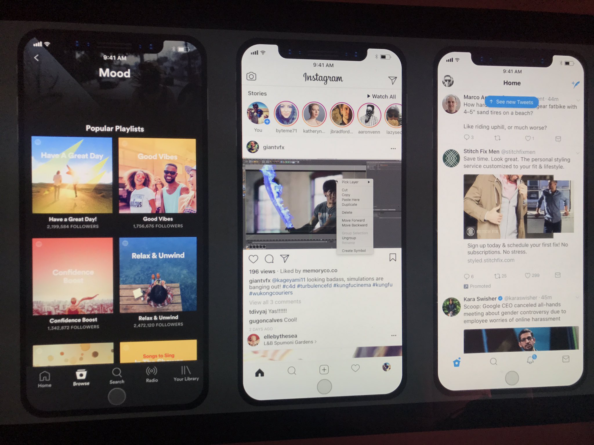
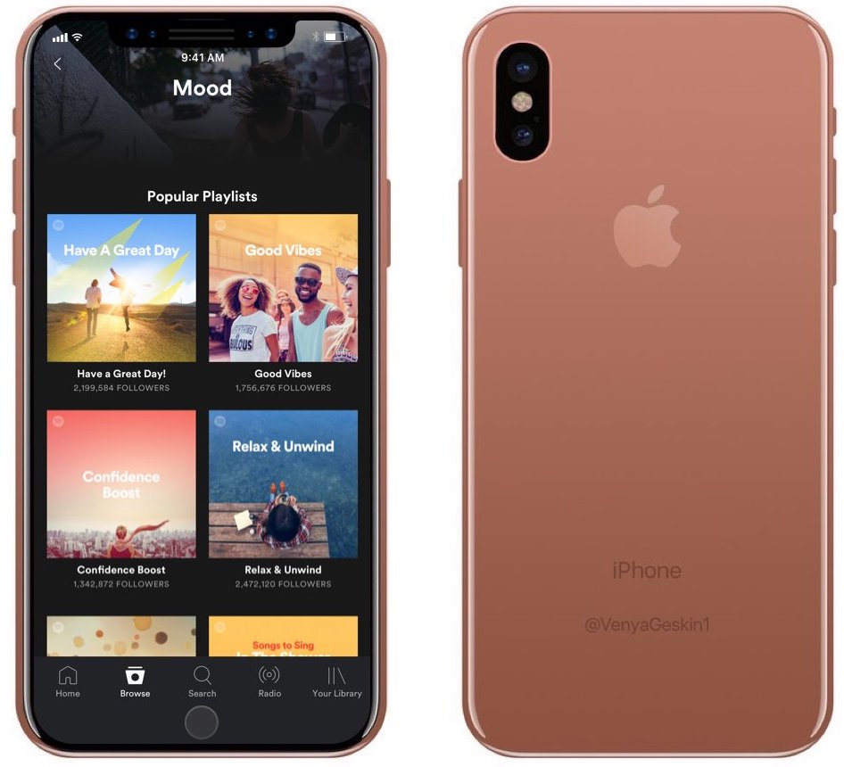
Taking iOS developer Steven Troughton-Smith’s findings regarding iPhone 8’s resizable, auto-hideable virtual Home button and a split status bar sitting between the phone’s notch at the top of the OLED display, user interface designer Maksim Petriv took it upon himself to imagine how your favorite apps like Spotify, Instagram and Twitter might embrace that notch and look like running on iPhone 8.
The concept image found at the top of the post imagines what popular apps such as Spotify, Instagram and Twitter might look like running on iPhone 8. And here are three ways Apple could choose to render apps while respecting that cutout at the top of the OLED display required to house the front-facing camera and sensor hardware.
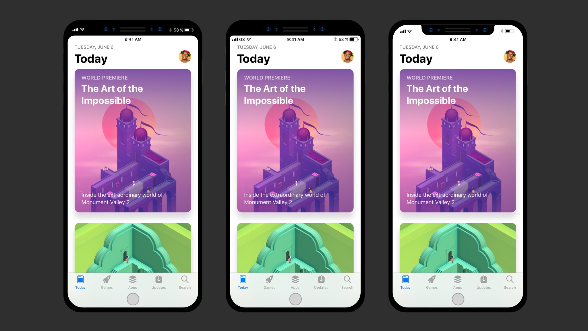
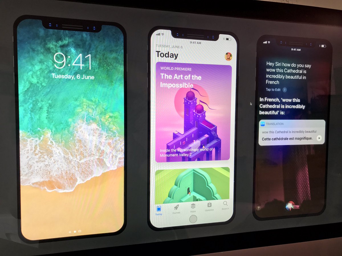
And here’s the Lock screen, App Store and Siri.
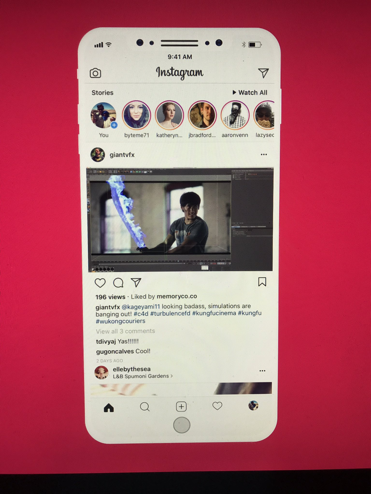
Rumors has it that there might be a version of iPhone 8 white an all-white front face. Here is a render of that.
If you’re wondering what that rumored copper-like iPhone 8 finish might look like when paired with Maksim’s renderings, here’s your answer.
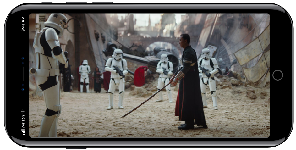
“Some of you asked if I did landscape mockups,” Petriv wrote. “Here is a video player mockup.”

As you can imagine, the virtual Home button remains hidden when playing video, just as Troughton-Smith has discovered analyzing the HomePod firmware code, while the rest of media controls are visible.
The Home button could also automatically disappear completely or minimize when playing games, something along the lines of this.
How do you like Maksim’s conceptual renderings?
Source link: http://www.idownloadblog.com/2017/08/11/concept-iphone-8-apps-notch/


Leave a Reply