macOS Tahoe reverses the Finder icon and Apple needs to roll it back
In a change that irked some users, Apple’s new macOS Tahoe operating system flips the decades-old Finder icon, which has become synonymous with the Mac.
Stephen Hackett, writing on his website 512 Pixels, has noted the difference between the Finder icon on macOS Sequoia, displayed on the left in the image at the top of this post, and the new icon in macOS Tahoe, shown on the right.
He thinks Apple should roll back the change because swapping the dark and light sides just feels wrong and breaks decades of Finder history. “The Finder logo has changed over the years, but the dark side has been on the left forever,” he noted.
macOS Tahoe reverses the iconic Finder icon
The Finder icon, the leftmost icon in your Mac’s Dock, has received more than just a glassy design overhaul in macOS Tahoe. I’m liking it because I don’t oppose change. At the same time, I understand people who don’t like the fact that Tahoe has flipped the iconic logo, which has become synonymous with the Mac.
Hackett, who is clearly among the group dissatisfied with the new-look Finder icon, has filed this with Apple as feedback via apple.com/feedback, and you can do the same if you run the macOS Tahoe beta. The more people tell Apple they want the old Finder icon style back, the higher the chances Apple will do something about it.
Big Sur tweaked the Finder icon
The last time Apple redesigned macOS icons was with the November 2020 release of macOS 11 Big Sur. The previous icon that showed a smiling computer screen was replaced with a blue icon. Back then, the change prompted some die-hard Apple fans to complain, saying the new icon was less intuitive.
While it’s trivial to change icons on your Mac, the Finder icon is stored on the system volume, which is sealed and cannot be modified at all.
macOS Tahoe brings new icon modes

The new macOS Tahoe operating system brings several icon-related features. For starters, there are now separate icons for Light and Dark modes, like on the iPhone and iPad. I never liked the sight of bright icons in Dark Mode, so I’m liking this change because it will make Dark Mode easier on the eyes.

The icon tinting feature that has been available on the iPhone since iOS 18 is also supported on macOS Tahoe. With it, you can apply a monochromatic tint to icons and widgets if you don’t like them colorful.

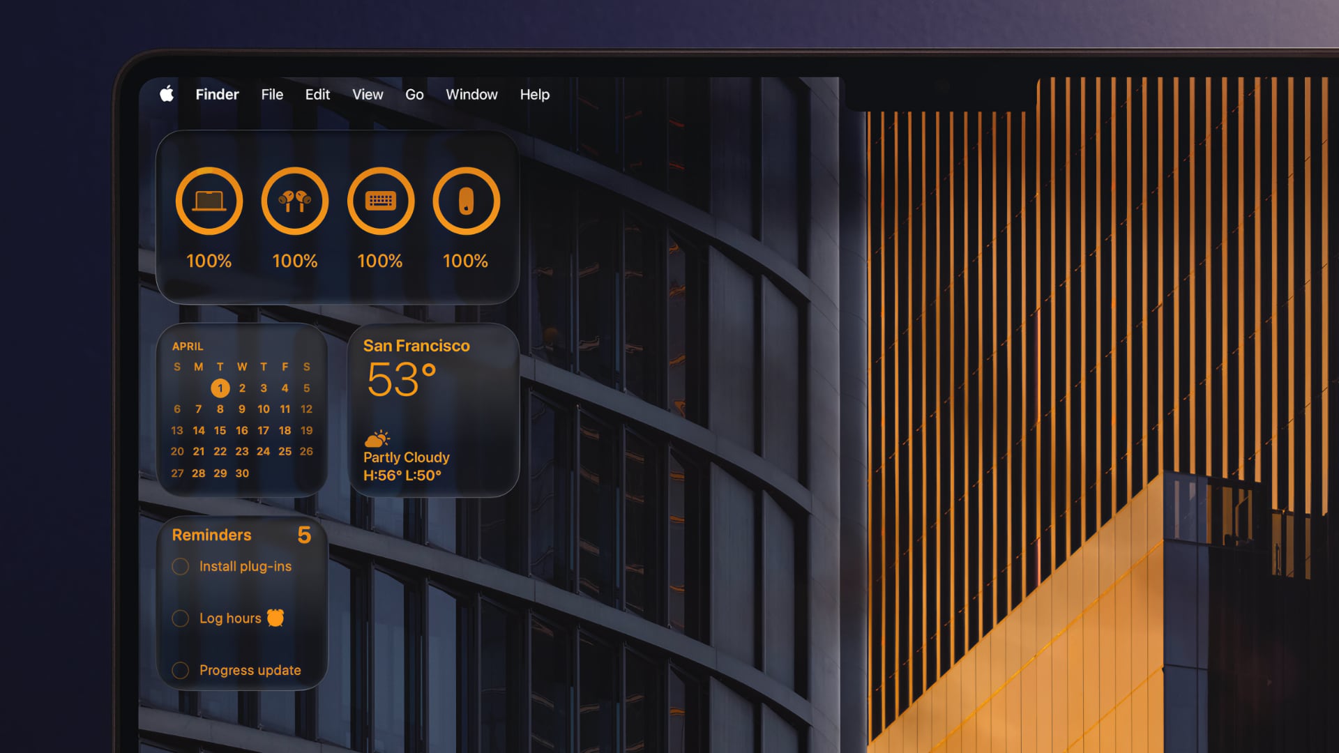
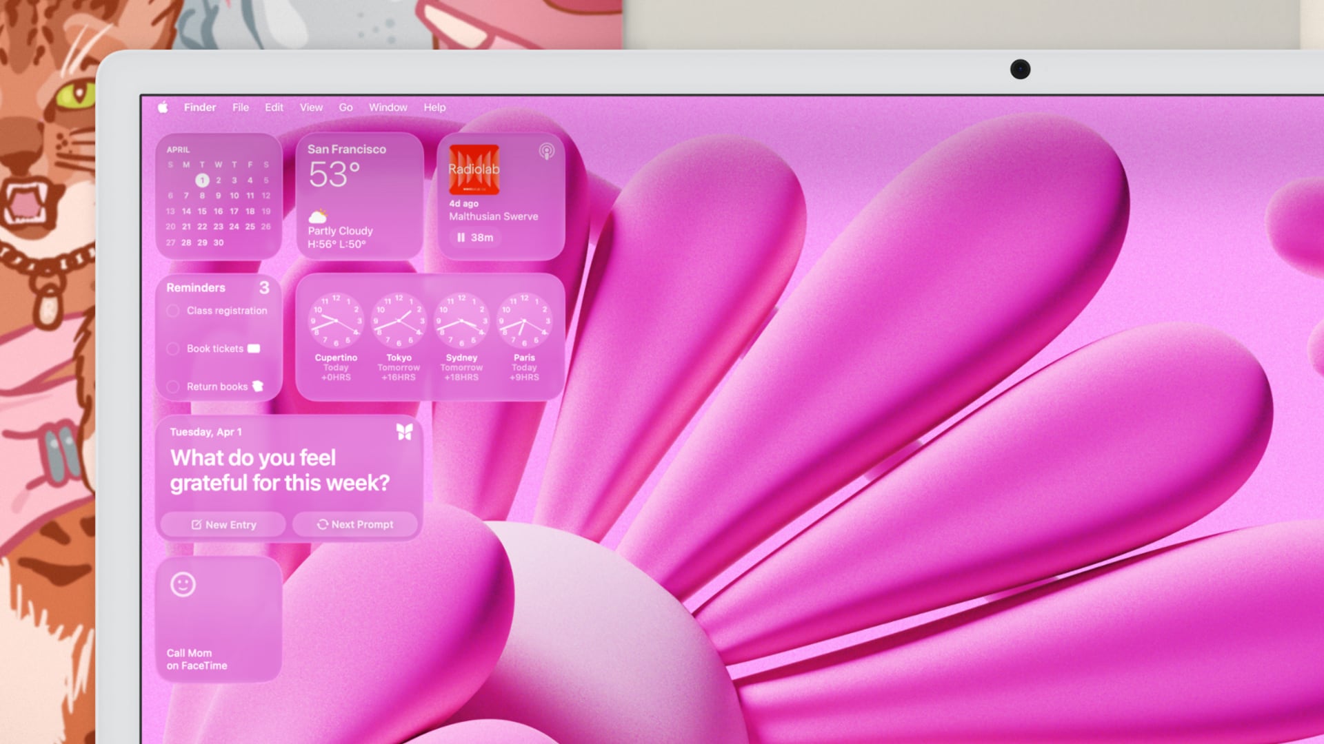
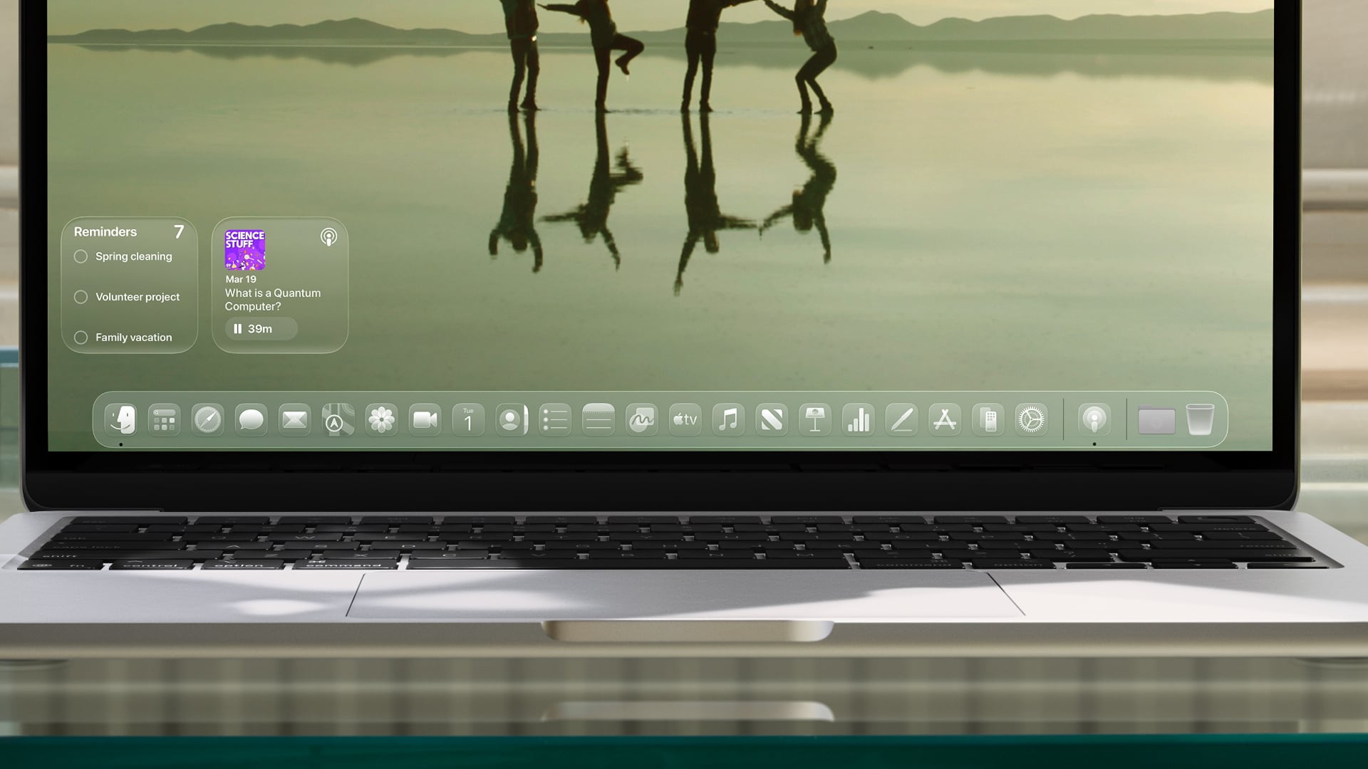
On top of that, you can colorize any folder or add a symbol or emoji to a folder icon, similar to the Folder Colorizer app. Plus, you get an all-new Clear view (also available on the iPhone, iPad and CarPlay) which makes the icon translucent as if made from glass.
Install the macOS Tahoe 26 developer beta
If you’d like to take macOS Tahoe for a spin before it releases publicly this fall, and you’re a member of the $99/year Apple Developer Program, feel free to peruse our tutorial to install macOS Tahoe on a different partition of your Mac alongside your existing macOS version.
If you’re not a member of the program, you will be able to install the software in July, when Apple is scheduled to release the first betas of iOS 26, iPadOS 26, macOS Tahoe 26 and other operating systems that the general public will be able to download and install by enrolling their devices through beta.apple.com.
The hardware requirements for macOS Tahoe have tightened, with an Apple silicon Mac now required to run the software. macOS Tahoe leaves owners of Intel-based Macs like this author out in the cold. For a detailed overview of everything Apple announced at the WWDC25 keynote, check out our roundup.
Source link: https://www.idownloadblog.com/2025/06/10/macos-tahoe-finder-icon-complaint/


Leave a Reply